United by CITY: The Tifos
Written by: Michael Haffner
When L. Frank Baum's popular children's book "The Wizard of Oz" was adapted into a feature film in 1939, the pages came to life in vivid technicolor transporting audiences and giving them a few frights along the way. Many of those frights are thanks in part to the iconic villain in the story. The Wicked Witch of the West has since become one of the more recognizable characters in film history. Not only that, but the green skin, hook nose, and black cape and hat have become synonymous with the general depiction people have in their head of a witch.
For those unaware, the basic story of the book and film follows a girl from Kansas who is transported via a cyclone to a land far away called Oz. It’s there where the Wicked Witch is after the new visitor – and her little dog too – as she helps out a new merry band of friends as they journey to meet the all-powerful wizard. But what casts a dark cloud over the tale is the ever-present witch and her evil flying monkeys.
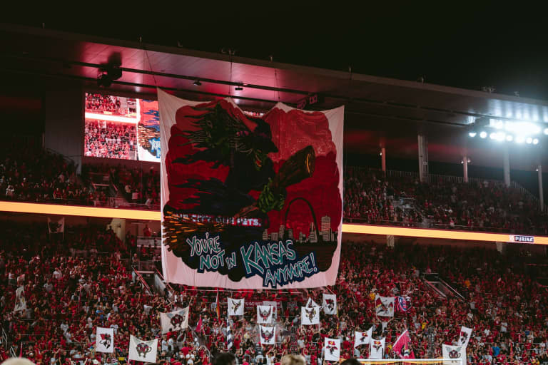
The character was the perfect storytelling device to represent MLS’s newest rivalry and strike fear in the heart of CITY’s neighbors in Kansas. Throughout the 2023 soccer season, St. Louis CITY SC and Sporting Kansas City had been building a rivalry that fans, players, and journalists quickly picked up on. The St. Louligans took the idea of a “Wizard of Oz” tifo to Jamie Toon, a local tattoo artist who has spent the last 20 years tattooing, drawing, and painting hobby miniatures for table-top games.
But designing something at the scale of a tifo was certainly out of the scope of the tattoos and miniatures he has painted. This was new territory for Jamie, but not unlike Dorothy in the Land of Oz, thankfully he wasn’t alone on the journey.
This is the story – in his words – of designing the tifo for the St. Louis CITY SC match versus Sporting Kansas City at CITYPARK on September 30, 2023.

Taking a Page from a Different Scary Story
“Tales from the Crypt” was a popular anthology horror television series from the 1990s, but long before those scary stories graced the small screen, they were printed in the form of comic books. EC Comics was known for publishing horror and science fiction comics in the 1940s and 50s. The popular ghastly tales incorporated striking art of zombies, werewolves, and other creatures that go bump in the night. The groundbreaking company was a huge influence on the comic industry and many artists moving forward.
“When they approached me, my first thought was to do more of a scary rendering. I immediately went to like old scary comics that you would see from EC Comics. Flipping through art in Vault of Horror and Tales from the Crypt helped me while I was brainstorming my own ideas. I knew with the tifo that you couldn’t really do like half-tones and gradients. That is the same with the old comic art.”
A Dynamic Perspective Heading Into a Third Match
Going into the match, there was a lot of tension. Each team had won a match in their previous encounters, leading into a third rivalry battle that would help change the perspective of how St. Louis was seen against a team that had long been a staple in the league. It had all the makings for a night of high drama. And it all began with an image that set the stage in a dramatic and dynamic way.
“The most challenging part was getting the entire image to work in a square. I was trying to fill as much of the space as possible. From a design perspective, I didn't want to have a lot of white or areas that were blank. That’s where the foreshortening and the perspective of the witch came into play. If I have her reaching out and I have the broom angled, then the broom doesn't have to be as long, and it would fit in the square better. That dynamic posing added more drama too, and we wanted to kick up the drama.”
A Message that Served as a Warning
As the tifo was raised to the iconic witch’s theme from “Wizard of Oz”, the witch loomed large over the supporter section as fans throughout the stadium cheered. But the moment that caused the stadium octave to hit the next level was when “You’re Not in Kansas Anymore” was seen by all. The words of warning were punctuated by flying monkeys painted on “two-poles” that were each uniquely designed by the different supporter groups in the section. It was a reveal that was designed to make that impact. And in typical CITYPARK fashion, the fan response did not disappoint.
“The phrase “You're Not in Kansas Anymore” wasn’t intended for it to come from the witch. Having it at the bottom was always my idea to have the words at the bottom when it was pulled up. It worked to delineate the bottom of the image but having the words at the bottom closer to the supporter section made it look like the message was coming from all of us. I wanted all the KC players and fans to be scared.”


